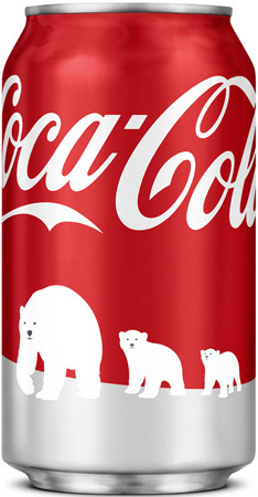
Coca Cola turns Arctic white
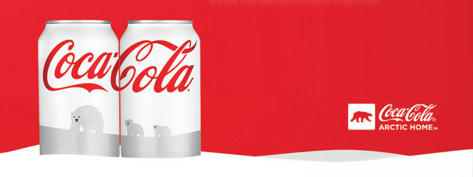
Coca-Cola never alters its iconic packaging lightly. But this winter, there was an excellent reason for turning its red cans Artic white.
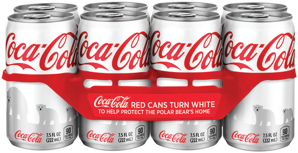
The drinks giant is backing WWF’s work in the Artic to protect the polar bears’ endangered environment. As a key part of an attention grabbing campaign to raise awareness and donations, they decided to use their flagship brand by dramatically changing its packaging colour– for the first time in 125 years.
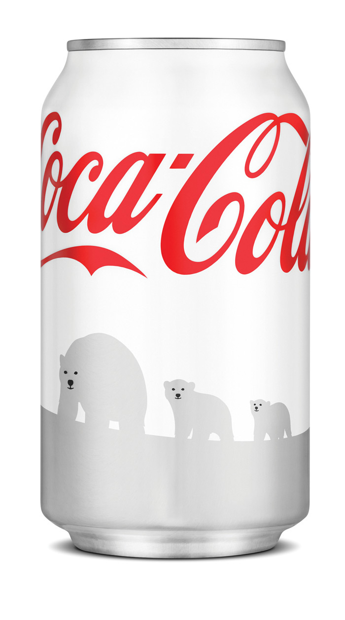
Darren Whittington was commissioned by Turner Duckworth to develop the iconic polar bear images at the heart of their innovative design.
How to depict these majestic animals? Cuddly anthropomorphism was out, but the bears still had to be friendly, engaging, animated and believable. Darren explains, ‘The biggest challenge was to capture all that in a simple silhouetted form with minimal features to reproduce on the packaging and marketing material’.
He succeeded, as proven by the eye-catching scenes – both credible and endearing – of a mother and her two cubs making their way across the Arctic, and of cubs at play featuring on the classic ‘gulp’ bottles.
Darren’s illustrations are appearing on 1.4 billion cans in North American stores this winter. Consumers are texting $1 to top up the $2 million already donated by Coca-Cola to WWF.
__________________________________________________________________________
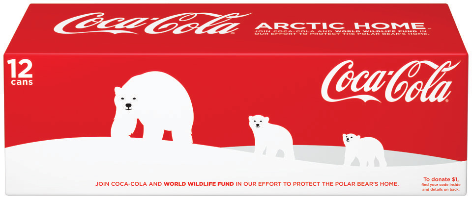
The change has caused a stir in America. For some Coke fans the all-white can was a step too far and Darren’s polar bears now stand out against a familiar red sky.
__________________________________________________________________________
• There’s a great article on the launch of this campaign via www.thedieline.com
__________________________________________________________________________
• Here’s the stir it’s been causing:
Ben Sheidler, a Coca-Cola spokesman, said: “Bringing in the red can has also created a lot of stir. That’s exactly what we want to happen, is to have people talk about it and learn about the programme.”
Now, however, fans of the white can are fighting back. A Facebook campaign has sprung up complaining about the switch back to red.
“Just because those who are too lazy to read pick up the wrong drink doesn’t mean we should all pay the price,” wrote one protester. “Save the polar bears and save the cans.”
__________________________________________________________________________
Also if you want to see how ABC News reported it together with a Coke test that saw consumers saying it tasted different! ABCNews
__________________________________________________________________________
Let alone the Facebook White can fan pages! Just Google it. Crazy.
